Identifying New York's Busiest MTA Stations
by Sam Funk
Overview
At the beginning of the summer, WomenTechWomenYes (WTWY) has a gala in New York City. In order to generate awareness of their new and inclusive organization and to attract passionate individuals to their gala, WTWY sends out street teams to collect email addresses. These teams will be placed at the entrances of various subway stations with the goal of gathering the most signatures, ideally from those who will attend the gala and contribute to the cause. Using MTA subway data, WTWY wants to find which stations will allow their teams to be most effective in reaching their goals.
Data
From the MTA database, we pulled weekly turnstile data for May and June of 2017. We also decided to incorporate demographic and economic factors into our analysis. This data originated from the 2015 American Community and was broken down by zip code. The MTA data would allow us to measure the popularity of various stations. From the census data, we used variables such as median income, age, sex, and bachelor degree features. The sources of these datasets are listed below.
- MTA Turnstile Data
- Median Income in the Past 12 Months (in 2015 inflation-adjusted dollars)
- Field of Bachelor’s Degree for First Major
- Age and Sex
Analysis
The MTA data contains cumulative entries and exits for turnstiles in every New York City subway station. Using the timestamps, each observation can be converted into average entries and exits per hour. Next, we fragmented the data by day of the week and then again by time of day. Unsurprisingly, we noticed weekday rush hour periods were significantly more busy than midday and weekend levels. Referring back to WTWY’s goals, we decided to solely focus on these rush periods. Next, we aggregated entries and exits per hour for our total time horizon to find the average traffic each station was experiencing per rush period.
The census dataset only contains information on where individuals live. Because of this fact, we assumed subway riders have simple commutes - boarding and exiting relatively close to where they live. Additionally, we assumed residents have conventional work hours. This allows us to assume morning entries and evening exits correspond to individuals who live near their respective stations.
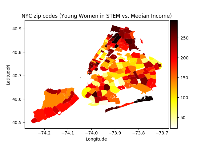
For each zip code in New York City, we pulled three statistics from the census data:
- Percentage of women between the age of 20 and 34
- Percentage of women with bachelor degrees in science, engineering, or a related field
- Median individual income
By combining the first two statistics, we get an estimate of young women interested in STEM fields for each zip code. Using the median individual income, we can see the overall economic status of each zip code. These metrics are useful for WTWY because they illustrate which areas contain individuals who might be interested in STEM as well as those who could be willing to donate to the cause.
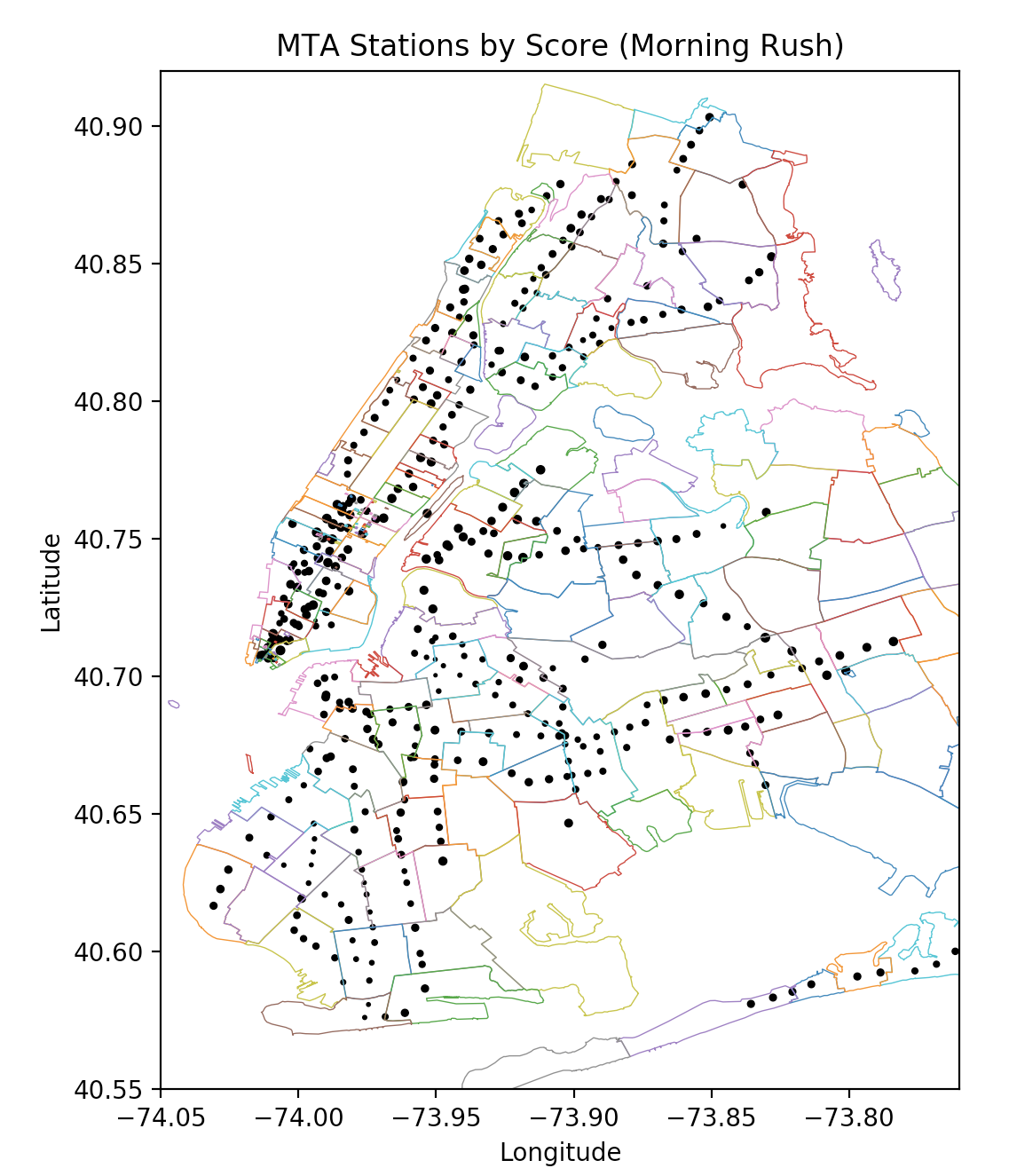
Scoring
After combining the two datasets on zip code, we calculated the percentile rank for each of the following:
- Average morning rush hour entries by station
- Average evening rush hour exits by station
- Percent of young women with STEM degrees by zip code
- Median individual income by zip code
Next, we calculated a weighted sum of these percentiles using the following weights:
- Station traffic = 0.4
- Women in STEM = 0.4
- Median income = 0.2
These weights may be adjusted by WTWY given their own assumptions and predictions. We used this specific allocation because we found income to crowd out the other two features at higher levels. We also wanted to highlight the station traffic and women in STEM features.
Results
With a weighted sum - or score - for each station, we can finally see where WTWY should position their street teams. For the morning rush period, these are the stations with the highest scores:
| Stations | Line |
|---|---|
| Times Square - 42 St | 1237ACENQRS |
| 34 St - Penn Station | 123 |
| 34 St - Penn Station | ACE |
| 34 St - Herald Square | BDFMNQRW |
| Fulton St | 2345ACJZ |
| Chambers St | ACE23 |
| Kew Gardens - Union Tp | EF |
| Brooklyn Bridge - City Hall | 456JZ |
| Wall St | 23 |
| 23 St | FM |
And for the evening rush, the highest scoring stations:
| Stations | Line |
|---|---|
| Times Square - 42 St | 1237ACENQRS |
| Wall St | 23 |
| Chambers St | ACE23 |
| Wall St | 45 |
| Brooklyn Bridge - City Hall | 456JZ |
| 5 Ave | 7BDFM |
| World Trade Center | ACE23 |
| Cortlandt St | RNW |
| 34 St - Herald Square | BDFMNQRW |
| Fulton St | 2345ACJZ |
After seeing these results, we were not too surprised with the stations that concentrated toward the top. Times Square, Penn Station, Herald Square, Fulton Street, Wall Street, and Chambers Street are all large stations that see a lot of daily traffic. However, looking a little further down our rankings, we noticed a few stations that fared well, for example, Astoria Avenue, Steinway Street, Vernon Blvd - Jackson Ave, and Bleecker Street.
Recommendations
We recommend WTWY consider the top 30 stations for both morning and evening rush periods. They may need to further reference qualitative factors of New York commuting. For example, if they wanted to focus on the large business centers, then they should station their teams at Midtown and the Financial District. If they wanted less of a corporate crowd then they could go to stations in SoHo, Williamsburg, or Astoria. In any manner, by combining station traffic levels and economic and demographic features, we get a better picture of WTWY plan of action. We hope they find this analysis and recommendations useful.
Moving forward, we could incorporate additional economic variables as well as industry and occupational data on zip codes. We would also consider looking at the location of universities and other scholarly centers. We could increase WTWY’s teams precision and effectiveness by breaking each station down by entrance.
Subscribe via RSS